Matplotlib Tutorial: Python Plotting
This
Matplotlib tutorial takes you through the basics Python data
visualization: the anatomy of a plot, pyplot and pylab, and much more
Humans are very visual creatures: we understand things better when we
see things visualized. However, the step to presenting analyses,
results or insights can be a bottleneck: you might not even know where
to start or you might have already a right format in mind, but then
questions like “Is this the right way to visualize the insights that I
want to bring to my audience?” will have definitely come across your
mind.
When you’re working with the Python plotting library Matplotlib, the first step to answering the above questions is by building up knowledge on topics like:
(To practice matplotlib interactively, try the free Matplotlib chapter at the start of this Intermediate Python course or see DataCamp’s Viewing 3D Volumetric Data With Matplotlib tutorial to learn how to work with matplotlib’s event handler API.)
Luckily, this library is very flexible and has a lot of handy, built-in defaults that will help you out tremendously. As such, you don’t need much to get started: you need to make the necessary imports, prepare some data, and you can start plotting with the help of the
Look at this example to see how easy it really is:
When you’re working with the Python plotting library Matplotlib, the first step to answering the above questions is by building up knowledge on topics like:
(To practice matplotlib interactively, try the free Matplotlib chapter at the start of this Intermediate Python course or see DataCamp’s Viewing 3D Volumetric Data With Matplotlib tutorial to learn how to work with matplotlib’s event handler API.)
What Does A Matplotlib Python Plot Look Like?
At first sight, it will seem that there are quite some components to consider when you start plotting with this Python data visualization library. You’ll probably agree with me that it’s confusing and sometimes even discouraging seeing the amount of code that is necessary for some plots, not knowing where to start yourself and which components you should use.Luckily, this library is very flexible and has a lot of handy, built-in defaults that will help you out tremendously. As such, you don’t need much to get started: you need to make the necessary imports, prepare some data, and you can start plotting with the help of the
plot() function! When you’re ready, don’t forget to show your plot using the show() function.Look at this example to see how easy it really is:
Note that you import the
pyplot module of the matplotlib library under the alias plt.Congrats, you have now successfully created your first plot! Now let’s take a look at the resulting plot in a little bit more detail:
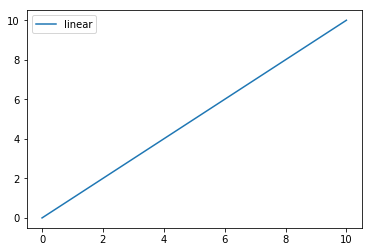
Great, isn’t it?
What you can’t see on the surface is that you have -maybe unconsciously- made use of the built-in defaults that take care of the creation of the underlying components, such as the Figure and the Axes. You’ll read more about these defaults in the section that deals with the differences between pylab and pyplot.
For now, you’ll understand that working with matplotlib will already become a lot easier when you understand how the underlying components are instantiated. Or, in other words, what the anatomy of a matplotlib plot looks like:
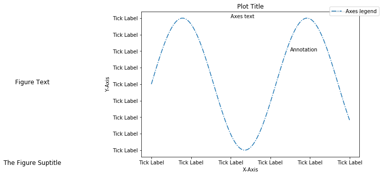
In essence, there are two big components that you need to take into account:
- The Figure is the overall window or page that everything is drawn on. It’s the top-level component of all the ones that you will consider in the following points. You can create multiple independent Figures. A Figure can have several other things in it, such as a suptitle, which is a centered title to the figure. You’ll also find that you can add a legend and color bar, for example, to your Figure.
- To the figure you add Axes. The Axes is the area on which the data is plotted with functions such as
plot()andscatter()and that can have ticks, labels, etc. associated with it. This explains why Figures can contain multiple Axes.
Tip: when you see, for example,
plt.xlim, you’ll call ax.set_xlim() behind the covers. All methods of an Axes object exist as a function in the pyplot module and vice versa. Note that mostly, you’ll use the functions of the pyplot module because they’re much cleaner, at least for simple plots!You’ll see what “clean” means when you take a look at the following pieces of code. Compare, for example, this piece of code:
With the piece of code below:
The second code chunk is definitely cleaner, isn’it it?
Note that the above code examples come from the Anatomy of Matplotlib Tutorial by Benjamin Root.
However, if you have multiple axes, it’s still better to make use of the first code chunk because it’s always better to prefer explicit above implicit code! In such cases, you want to make use of the Axes object
ax.Next to these two components, there are a couple more that you can keep in mind:
- Each Axes has an x-axis and a y-axis, which contain ticks, which have major and minor ticklines and ticklabels. There’s also the axis labels, title, and legend to consider when you want to customize your axes, but also taking into account the axis scales and gridlines might come in handy.
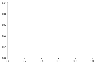
- Spines are lines that connect the axis tick marks and that designate the boundaries of the data area. In other words, they are the simple black square that you get to see when you don’t plot any data at all but when you have initialized the Axes, like in the picture below:
- You see that the right and top spines are set to invisible.
Note that you’ll sometimes also read about Artist objects, which are virtually all objects that the package has to offers to users like yourself. Everything drawn using Matplotlib is part of the Artist module. The containers that you will use to plot your data, such as Axis, Axes and Figure, and other graphical objects such as text, patches, etc. are types of Artists.
For those who have already got some coding experience, it might be good to check out and study the code examples that you find in the Matplotlib gallery.

Data For Matplotlib Plots
As you have read in one of the previous sections, Matplotlib is often used to visualize analyses or calcuations. That’s why the first step that you have to take in order to start plotting in Python yourself is to consider revising NumPy, the Python library for scientific computing.Scientific computing might not really seem of much interest, but when you’re doing data science you’ll find yourself working a lot with data that is stored in arrays. You’ll need to perform operations on them, inspect your arrays and manipulate them so that you’re working with the (subset of the) data that is interesting for your analysis and that is in the right format, etc.
In short, you’ll find NumPy extremely handy when you’re working with this data visualization library. If you’re interested in taking a NumPy tutorial to start well-prepared, go and take DataCamp’s tutorial and make sure to have your copy of our NumPy cheat sheet close!
Of course, arrays are not the only thing that you pass to your plotting functions; There’s also the possibility to, for example, pass Python lists. If you would like to know more about Python lists, consider checking out our Python list tutorial or the free Intro to Python for Data Sciencecourse.
Create Your Plot
Alright, you’re off to create your first plot yourself with Python! As you have read in one of the previous sections, the Figure is the first step and the key to unlocking the power of this package. Next, you see that you initialize the axes of the Figure in the code chunk above withfig.add_axes():Easy, isn’t it?
What Is A Subplot?
You have seen all components of a plot and you have initialized your first figure and Axes, but to make things a bit more complicated, you’ll sometimes see subplots pop up in code.Now, don’t get discouraged just yet!
You use subplots to set up and place your Axes on a regular grid. So that means that in most cases, Axes and subplot are synonymous, they will designate the same thing. When you do call subplot to add Axes to your figure, do so with the
add_subplots() function. There is, however, a difference between the add_axes() and the add_subplots() function, but you’ll learn more about this later on in the tutorial.Consider the following example:
You see that the
add_subplot() function in itsef also poses you with a challenge, because you see add_subplots(111) in the above code chunk.What does
111 mean?Well,
111 is equal to 1,1,1, which means that you actually give three arguments to add_subplot().
The three arguments designate the number of rows (1), the number of
columns (1) and the plot number (1). So you actually make one subplot.Note that you can really go bananas with this function when you are using this function, especially when you’re just starting out with this library and you keep on forgetting for what the three numbers stand.
Consider the following commands and try to envision what the plot will look like and how many Axes your Figure will have:
ax = fig.add_subplot(2,2,1).Got it?
That’s right, your Figure will have four axes in total, arranged in a structure that has two rows and two columns. With the line of code that you have considered, you say that the variable ax is the first of the four axes to which you want to start plotting. The “first” in this case means that it will be the first axes on the left of the 2x2 structure that you have initialized.
What Is The Difference Between add_axes() and add_subplot()?
The difference between fig.add_axes() and fig.add_subplot()
doesn’t lie in the result: they both return an Axes object. However,
they do differ in the mechanism that is used to add the axes: you pass a
list to add_axes() which is the lower left point, the width and the height. This means that the axes object is positioned in absolute coordinates.In contrast, the
add_subplot() function doesn’t provide
the option to put the axes at a certain position: it does, however,
allow the axes to be situated according to a subplot grid, as you have
seen in the section above.In most cases, you’ll use
add_subplot() to create axes; Only in cases where the positioning matters, you’ll resort to add_axes(). Alternatively, you can also use subplots() if you want to get one or more subplots at the same time. You’ll see an example of how this works in the next section.How To Change The Size of Figures
Now that you have seen how to initialize a Figure and Axes from scratch, you will also want to know how you can change certain small details that the package sets up for you, such as the figure size.Let’s say you don’t have the luxury to follow along with the defaults and you want to change this. How do you set the size of your figures manually?
Like everything with this package, it’s pretty easy, but you need to know first what to change.
Add an argument
figsize to your plt.figure() function of the pyplot module; You just have to specify a tuple with the width and hight of your figure in inches, just like this plt.figure(figsize=(3,4)), for it to work.Note that you can also pass
figsize to the the plt.subplots() function of the same module; The inner workings are the same as the figure() function that you’ve just seen.See an example of how this would work here:
Working With Pyplot: Plotting Routines
Now that all is set for you to start plotting your data, it’s time to take a closer look at some plotting routines. You’ll often come across functions likeplot() and scatter(), which either draw points with lines or markers connecting them, or draw unconnected points, which are scaled or colored.But, as you have already seen in the example of the first section, you shouldn’t forget to pass the data that you want these functions to use!
These functions are only the bare basics. You will need some other functions to make sure your plots look awesome:
| ax.bar() | Vertical rectangles |
| ax.barh() | Horizontal rectangles |
| ax.axhline() | Horizontal line across axes |
| ax.vline() | Vertical line across axes |
| ax.fill() | Filled polygons |
| ax.fill_between() | Fill between y-values and 0 |
| ax.stackplot() | Stack plot |
x and y variables have already been loaded in for you:Most functions speak for themselves because the names are quite clear. But that doesn’t mean that you need to limit yourself: for example, the
fill_between() function is perfect for those
who want to create area plots, but they can also be used to create a
stacked line graph; Just use the plotting function a couple of times to
make sure that the areas overlap and give the illusion of being stacked.Note that, of course, simply passing the data is not enough to create great plots. Make sure to manipulate your data in such a way that the visualization makes sense: don’t be afraid to change your array shape, combine arrays, etc.
When you move on and you start to work with vector fields or data distributions, you might want to check out the following functions:
| ax.arrow() | Arrow |
| ax.quiver() | 2D field of arrows |
| ax.streamplot() | 2D vector fields |
| ax.hist() | Histogram |
| ax.boxplot() | Boxplot |
| ax.violinplot() | Violinplot |
On the other hand, when you work with 2-D or n-D data, you might also find yourself in need of some more advanced plotting routines, like these ones:
| ax.pcolor() | Pseudocolor plot |
| ax.pcolormesh() | Pseudocolor plot |
| ax.contour() | Contour plot |
| ax.contourf() | Filled contour plot |
| ax.clabel() | Labeled contour plot |
If you’re working with images or 2D data, for example, you might also want to check out
imshow() to show images in your subplots. For a practical example of how to use the imshow() function, go to DataCamp’s scikit-learn tutorial.The examples in the tutorial also make clear that this data visualization library is really the cherry on the pie in the data science workflow: you have to be quite well-versed in general Python concepts, such as lists and control flow, which can come especially handy if you want to automate the plotting for a great number of subplots. If you feel like revising these concepts, consider taking the free introduction to Python for data science course.
Customizing Your PyPlot
A lot of questions about this package come from the fact that there are a lot of things that you can do to personalize your plots and make sure that they are unique: besides adjusting the colors, you also have the option to change markers, linestyles and linewidths, add text, legend and annotations, and change the limits and layout of your plots.It’s exactly the fact that there is an endless range of possibilities when it comes to these plots that makes it difficult to set out some things that you need to know when you start working on this topic.
Great tips that you should keep in the back of your mind are not only the gallery, which contains many real-life examples that are already coded for you and which you can use, but also the documentation, which can tell you more about the arguments that you can pass to certain functions to adjust visual features.
Also keep in mind that there are multiple solutions for one problem and that you learn most of this stuff when you’re getting your hands dirty with the package itself and when you run into troubles. You’ll see some of the most common questions and solutions in this section.
Deleting an Axes
If you ever want to remove an axes form your plot, you can usedelaxes() to remove and update the current axes:Note that you can restore a deleted axes by adding
fig.add_axes(ax) right after fig.delaxes(ax3).How To Put The Legend Out of the Plot
There are a number of ways to address this question, but mostly all come back to the arguments that you can provide tolegend():- You can specify the
locorlocationargument to something like center left or upper right, which ensures that your legend does not fall in the Axes or subplot area. - Alternatively, you can also add the
bbox_to_anchorargument to your function and pass a tuple with the coordinates in which you want to put the legend. In this case, the box is put in the upper right corner of the plotting area:ax.legend(bbox_to_anchor=(1.1, 1.05)).
How To Set Plot Title And Axes Labels
To change your plot title and axes labels, you can follow one of the following approaches, depending of which container of which you want to make use:- The easiest way to set these things right is by using
ax.set(title="A title", xlabel="x", ylabel="y")orax.set_xlim(),ax.set_ylim()orax.set_title(). - If you want to work with the figure, you might also resort to
fig.suptitle()to add a title to your plot. - If you’re making use of the default settings that the package has to offer, you might want to use
plt.title(),plt.xlabel(),plt.ylabel(). - Define your own style sheet or change the default
matplotlibrcsettings. Read more about this here.
How To Fix The Plot Layout
A thing to consider when you’re using subplots to build up your plot is the tight_layout function, which will help you to make sure that the plots fit nicely in your figure. You ideally call it after you have plotted your data and customized your plot; So that’s right before you callplt.show() that you should use plt.tight_layout().Additionally, you might also be interested to use
subplots_adjust(),
which allows you to manually set the width and height reserved for
blank space between subplots, and also fix the left and right sides, and
the top and bottom of the subplots.Showing, Saving And Closing Your Plot
After you have done all the necessary customizations, you will want to show your plot because, as you will have noticed from working in the terminal, you just get to see that an object is made, but you never see the nice plot every time you make adjustments.In the first example of this tutorial, this was implicitly done;
Do you remember? It’s this piece of code:
The line
plt.show() says indeed that you want to see the
plot. If you execute this line, you’ll see a window popping up. And
you’ll see if it looks like what you had in your mind!But this is where your questions start. How can I save this image and if it’s not to your liking, can you clear the image so that you can start anew? The following short sections will cover these questions.
How To Save A Plot To An Image File
You can easily save a figure to, for example, a png file by making use ofplt.savefig(). The only argument you need to pass to this function is the file name, just like in this example:# Save Figure
plt.savefig("foo.png")
# Save Transparent Figure
plt.savefig("foo.png", transparent=True)How To Save A Plot To A Pdf File
If you want to save multiple plots to a pdf file, you want to make use of the pdf backend, which you can easily import:# Import PdfPages
from matplotlib.backends.backend_pdf import PdfPages
# Initialize the pdf file
pp = PdfPages('multipage.pdf')
# Save the figure to the file
pp.savefig()
# Close the file
pp.close()
When To Use cla(), clf() or close()?
When you’re finally ready with the inspection of your plot, it’s time
to move on with something else (maybe with another plot!). When you’re
working with this data visualization library for the first time, it
might be weird at start because you can, of course, shut down the GUI
window that appears, but that’s usually not the way you want to handle
things, because it doesn’t always work as well when you’re working on
several things at a time.You have to explicitly tell Matplotlib to close down the plot that you’ve been working on so that you can move on. There are three functions that will come in handy once you’re at this point:
- Use
plt.cla()to clear an axis, plt.clf()to clear the entire figure, andplt.close()to close a window that has popped up to show you your plot.
Customizing Matplotlib
By now, you’re already familiar with some basic options to customize your plots. But what if the customizations that you want to make situate more on a library level instead of a plot level? In such cases, also, you don’t need to panic: Matplotlib offers you several options to adjust some of the internal workings. This section will just cover two options, namely style sheets and rc settings.If you want to know more, definitely check out this page.
How To Use A ggplot2 Style
For the R enthusiasts among you, Matplotlib also offers you the option to set the style of the plots toggplot. You can easily do this by running the following piece of code:# Import `pyplot`
import matplotlib.pyplot as plt
# Set the style to `ggplot`
plt.style.use("ggplot")rc Settings
“rc” is common for configuration files: they usually end inrc. It comes from the practice of having configs as executables: they are automatically run and configure settings, for example. You can read more about it here. Matplotlib has such an rc file to which you can make adjustments dynamically and statically.To dynamically change default rc settings, you can use the
rcParams variable:You just adjusted the line width in the example above, but you can also change figure size and dpi, line width, color and style, axes, axis and grid properties, text and font properties, …
If you want to work more statically, you should probably also know that you have a
matplotlibrc
configuration file, which you can use to customize all kinds of
properties (just like you did above with the line width parameter). If
you want to find this specific file, you can just run the following:import matplotlib
matplotlib.matplotlib_fname()Continue Learning
Congratulations! You have gone through today’s Matplotlib tutorial successfully! There is still much to learn, but you’re definitely ready to go out on your own and create your own amazing plots. Don’t miss out on DataCamp’s Matplotlib cheat sheet that can help you to make plots in no time, step by step.If you’re eager to discover more from Matplotlib, consider checking out DataCamp’s Viewing 3D Volumetric Data With Matplotlib tutorial to learn how to work with matplotlib’s event handler API or this tutorial, in which you’ll learn all about animating your plots.
If you’re ready to start exploring interactive data visualizations with Python, consider taking DataCamp’s Bokeh course and don’t miss our Bokeh cheat sheet.
No hay comentarios:
Publicar un comentario