MATLAB TUTORIAL for the First Course in Applied Differential Equations
http://www.cfm.brown.edu/people/dobrush/am33/Matlab/index.html
Return to Matlab page
Return to the main page (APMA0330)
Return to the Part 1 (Plotting)
Return to the Part 2 (First order ODEs)
Return to the Part 3 (Numerical Methods)
Return to the Part 4 (Second and Higher Order ODEs)
Return to the Part 5 (Series and Recurrences)
Return to the Part 6 (Laplace Transform)
Return to the Part 7 (Boundary Value Problems)
Part 1: Plotting
Prof. Vladimir A. Dobrushkin
This tutorial contains many matlab scripts.You, as the user, are free to use all codes for your needs, and have the right to distribute this tutorial and refer to this tutorial as long as this tutorial is accredited appropriately. Any comments and/or contributions for this tutorial are welcome; you can send your remarks to
matlab has a wide spectrum of plotting tools. The most popular and powerful one for 2-D plotting is function plot.
For a plot, it is necessary to define the independent variable that you are graphing with respect to.
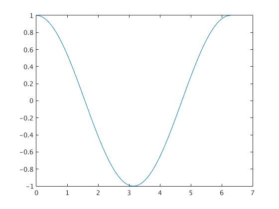
Let the independent variable be x and the range be interval [0 , 2π] and we want to plot the function \( y = 2\,\sin 3x - 2\,\cos x . \)
The command sequence is
Result is graph #1 on figure below. It is optimal for the axes' ticks.
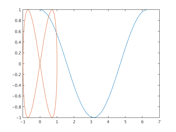
To exclude empty space we use "axis tight" after plot command (#2).
Sometimes it is important to show a curve when aspect ratio is 1.
Then use "axis equal" (#3) and even ''axis equal, axis tight'' (#4).
 The above code is not recommended for practical usage, so we present another version:

 There is a special subroutine multigraf.m
that allows one to place up to six Matlab figures on one page. THis
will give you a window into which you can insert several figures
produced by dfield.
There is a special subroutine multigraf.m
that allows one to place up to six Matlab figures on one page. THis
will give you a window into which you can insert several figures
produced by dfield.
Next we give examples of codes to display multiple plots on the same figure
 The code for a simple plot function in matlab is plot(independent variable, dependent variable).
The independent and dependent variables can be defined either before using the plot function or within the plot
function itself and must be matrices of equal sizes.
Therefore,
The code for a simple plot function in matlab is plot(independent variable, dependent variable).
The independent and dependent variables can be defined either before using the plot function or within the plot
function itself and must be matrices of equal sizes.
Therefore,
will produce the same graph as
 Now we plot a trigonometric function:
 In the above script, the independent variable is x with a range from 0
to 2π. The linspace function produces a row vector of 100 evenly spaced
points between 0 and 2π.
To plot multiple graphs in different windows, use the figure command
between plot functions. For multiple plots in the same window, use the
hold on command between plot functions or use commas between sets of
independent and dependent variables within the plot function.
In the above script, the independent variable is x with a range from 0
to 2π. The linspace function produces a row vector of 100 evenly spaced
points between 0 and 2π.
To plot multiple graphs in different windows, use the figure command
between plot functions. For multiple plots in the same window, use the
hold on command between plot functions or use commas between sets of
independent and dependent variables within the plot function.
 The axis command can be used to restrict the horizontal and/or vertical range as shown in the following example.


The simplest way to plot a downward sine function is to translate the entire function by ±π along the x-axis.
Plotting data in Matlab is simple. For example, to plot two functions
sin x and cos x on the interval 0<x<10, type in:
matlab lets you edit and annotate a graph directly from the window. For example, you can go to Tools> Edit Plot, then double-click the plot. A menu should open up that will allow you to add x and y
axis labels, change the range of the x-y axes; add a title to the
plot, and so on.
You can change axis label fonts, the line thickness and color, the background, and so on – usually by double-clicking what you want to change and then using the pop-up editor. You can export figures in many different formats from the File> Save As menu – and you can also print your plot directly. Play with the figure for yourself to see what you can do. Here are some basic commands and their functions:
>> xlabel % input your horizontal axis (abscissa) title here
>> ylabel % input your vertical axis (ordinate) title here
>> title % input your title here
>> legent % "my first curve title", "my second curve title" , and so on
>> grid on % turns grid lines on
>> figure % opens the plot in a new figure
>> axis off % to turn of the axis
>> axis on to turn axis back (they are on by default)
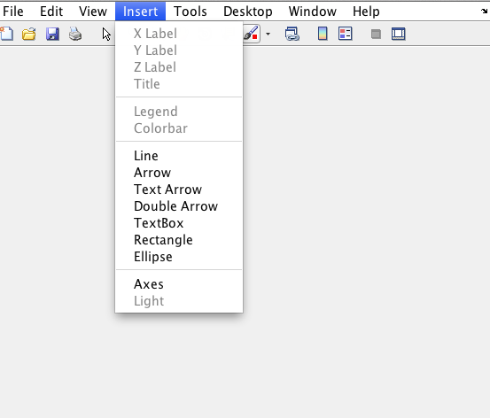
All stylistic features of graphs can be edited in the graph itself by clicking on the insert tab on the graph window:
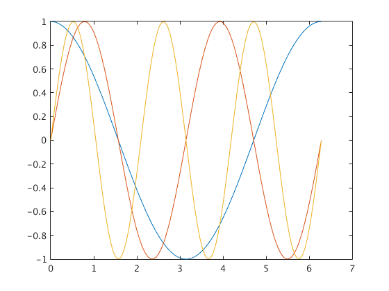
To plot multiple lines on the same plot you can use
Alternatively, you can use
 >>>>>>>>>>>>>>> am33/matlab/multiple.jpg
Here, x is a matrix. The notation x(1,:) fills the first row of x,
>>>>>>>>>>>>>>> am33/matlab/multiple.jpg
Here, x is a matrix. The notation x(1,:) fills the first row of x,
x(2,:) fills the second, and so on. The colon : ensures that the
number of columns is equal to the number of terms in the vector x. If
you prefer, you could accomplish the same calculation in a loop:
Notice that when you make a new plot, it always wipes out the old
one. If you want to create a new plot without over-writing old ones, you can use
The ‘figure’ command will open a new window and will assign a new
number to it (in this case, figure 2). If you want to go back and
re-plot an earlier figure you can use
If you like, you can display multiple plots in the same figure, by
typing
The new plot appears over the top of the old one, but you can drag it away by clicking on the arrow tool
and then clicking on any axis or border of new plot. You can also re-size the plots in the figure window
to display them side by side. The statement ‘newaxes = axes’ gives a name (or ‘handle’) to the new axes,
so you can select them again later. For example, if you were to create a third set of axes
you can then go back and re-plot `newaxes’ by typing
Doing parametric plots is easy. For example, try
.... circle.fig
matlab has vast numbers of different 2D and 3D plots. For example, to draw a filled contour plot of
the function z = sin(2 x) sin(2 y) for 0 < x <1, 0 < y <1, you can use polar graphs. For example, after executing the following script
you get
.... five.jpg
The first two lines of this sequence should be familiar: they create row vectors of equally spaced points.
The third needs some explanation – this operation constructs a matrix z, whose rows and columns satisfy
z(i,j) = sin(2*pi*y(i)) * sin(2*pi*x(j)) for each value of x(i) and y(j).
If you like, you can change the number of contour levels
>>contourf(x,y,z,15)
.... contour15.jpg
You can also plot this data as a 3D surface using
>> surface(x,y,z)
... survace.jpg
The result will look a bit strange, but you can click on the ‘rotation 3D’ button (the little box with a
circular arrow around it ) near the top of the figure window, and then rotate the view in the figure with
your mouse to make it look more sensible.
.... surface2.jpg
Let the independent variable be x and the range be interval [0 , 2π] and we want to plot the function \( y = 2\,\sin 3x - 2\,\cos x . \)
The command sequence is
x=linspace(0, 2*pi);
y=2*sin(3*x)-2*cos(x);
figure
plot(x,y )
title('Default view')
xlabel('#1')
figure
plot(x, y)
axis tight
title('axis tight')
xlabel('#2')
figure
plot(x, y)
axis equal
title('axis equal')
xlabel('#3')
figure
plot(x, y)
axis equal, axis tight
title('axis equal, axis tight')
xlabel('#4')function plotting
x=linspace(0, 2*pi); % compute an argument
y=2*sin(3*x)-2*cos(x); % compute a function of argument x
p1('Default view','#1',x,y) % plotting of the 1st graph
p1('axis tight','#2',x,y) % plotting of the 2nd graph
axis tight % set axis to tight (graph #2)
p1('axis equal','#3',x,y) % plotting the 3rd graph
axis equal % set axis to be equal (graph #3)
p1('axis equal, axis tight','#4',x,y) % plotting the 4th graph
axis equal, axis tight % set axis to be equal and tight (graph #4)
function p1(a,b,x,y) % plotting function
figure % new figure
plot(x,y) % plotting graph
title(a) % plotting a title
xlabel(b) % plotting a label for abscissa% PLOT(X,Y) plots vector Y versus vector X.
% Various line types, plot symbols and colors may be obtained with plot(X,Y,S)
% where S is a character string made from one element from any or all the following 3 columns:
%
% b blue . point - solid
% g green o circle : dotted
% r red x x-mark -. dashdot
% c cyan + plus -- dashed
% m magenta * star (none) no line
% y yellow s square
% k black d diamond
% w white v triangle (down)
% ^ triangle (up)
% < triangle (left)
% > triangle (right)
% p pentagram
% h hexagram
% plot(tn, yn, 'bx') plots blue x-mark at each data point but does not draw any line.
I. Displaying multiple plots
We give examples of codes to display two graphs in two different figuresx=1:100; % making an array of x from 1 to 100
y1=x.^2; % defining and calculating y1 as x.^2 . NOTE: .^ opertator is used for element wise array manupulation
y2=(x.^3)/100; % defining and calculating y2 as (x.^3)/100
figure % opens new figure
plot(x,y1) % plots the first graph of x-y1
figure % opens second new figure
plot(x,y2) % plots the second graph of x-y2Next we give examples of codes to display multiple plots on the same figure
x=1:100; % making an array of x from 1 to 100
y1=x.^2; % defining and calculating y1 as x.^2 . NOTE: .^ opertator is used for element wise array manupulation
y2=(x.^3)/100; % defining and calculating y2 as (x.^3)/100
figure     % opens new figure
plot(x,y1) % plots the first graph of x-y1
hold on
plot(x,y2) % plots the second graph of x-y2 plot([1, 2, 3, 4], [1, 2, 3, 4])x = [1, 2, 3, 4];
y = [1, 2, 3, 4];
plot(x, y)x = linspace(0, 2*pi);
plot(x, 2*sin(3*x)-2*cos(x))t1 = linspace(0, pi);
t2 = linspace(pi, 2*pi);
plot(cos(t1), sin(t1), 'k', cos(t2), sin(t2), '--k', 'LineWidth', 2)x = linspace(-0.5, 0.5);
plot(x, exp(10*x), 'k', 'LineWidth', 2)
xlabel('x');
ylabel('exp(10*x)');plot(x, exp(10*x), 'k', 'LineWidth', 2)
xlabel('x');
ylabel('exp(10*x)')
axis([-0.5, 0.5, 0, 10]);The simplest way to plot a downward sine function is to translate the entire function by ±π along the x-axis.
x = -5:0.1:5;
plot(x, sin(x + pi))sin x and cos x on the interval 0<x<10, type in:
 t = 0:.1:10;
 x=cos(t); y=sin(2*t);
plot(t,x,t,y)You can change axis label fonts, the line thickness and color, the background, and so on – usually by double-clicking what you want to change and then using the pop-up editor. You can export figures in many different formats from the File> Save As menu – and you can also print your plot directly. Play with the figure for yourself to see what you can do. Here are some basic commands and their functions:
>> xlabel % input your horizontal axis (abscissa) title here
>> ylabel % input your vertical axis (ordinate) title here
>> title % input your title here
>> legent % "my first curve title", "my second curve title" , and so on
>> grid on % turns grid lines on
>> figure % opens the plot in a new figure
>> axis off % to turn of the axis
>> axis on to turn axis back (they are on by default)
All stylistic features of graphs can be edited in the graph itself by clicking on the insert tab on the graph window:
To plot multiple lines on the same plot you can use
 clear all
     for i=1:101 t(i) = 2*pi*(i-1)/100; end
     x = cos(t);
  plot(t,x)
hold on
y = sin(2*t);
plot(x,y) Alternatively, you can use
 clear all
        for i=1:101 t(i) = 2*pi*(i-1)/100; end
            x(1,:) = cos(t);
            x(2,:) = sin(2*t);
            x(3,:) = sin(3*t);
plot(t,x)x(2,:) fills the second, and so on. The colon : ensures that the
number of columns is equal to the number of terms in the vector x. If
you prefer, you could accomplish the same calculation in a loop:
 for i=1:length(x) y(1,i) = sin(x(i)); y(2,i) = sin(2*x(i)); y(3,i) = sin(3*x(i)); end
plot(x,y)one. If you want to create a new plot without over-writing old ones, you can use
 figure
plot(x,y)number to it (in this case, figure 2). If you want to go back and
re-plot an earlier figure you can use
 figure(1)
plot(x,y)typing
 newaxes = axes;
 plot(x,y)
The new plot appears over the top of the old one, but you can drag it away by clicking on the arrow tool
and then clicking on any axis or border of new plot. You can also re-size the plots in the figure window
to display them side by side. The statement ‘newaxes = axes’ gives a name (or ‘handle’) to the new axes,
so you can select them again later. For example, if you were to create a third set of axes
 yetmoreaxes = axes;
plot(x,y) axes(newaxes);
plot(x,y) for i=1:101 t(i) = 2*pi*(i-1)/100; end
x = sin(t); y = cos(t);
plot(x,y).... circle.fig
matlab has vast numbers of different 2D and 3D plots. For example, to draw a filled contour plot of
the function z = sin(2 x) sin(2 y) for 0 < x <1, 0 < y <1, you can use polar graphs. For example, after executing the following script
 for i=1:101
      theta(i) = -pi + 2*pi*(i-1)/100;
      rho(i) = 2*sin(5*theta(i));
 end
 figure
polar(theta,rho).... five.jpg
 for i =1:51 x(i) = (i-1)/50; y(i)=x(i); end
      z = transpose(sin(2*pi*y))*sin(2*pi*x);
 figure
      contourf(x,y,z)
The third needs some explanation – this operation constructs a matrix z, whose rows and columns satisfy
z(i,j) = sin(2*pi*y(i)) * sin(2*pi*x(j)) for each value of x(i) and y(j).
If you like, you can change the number of contour levels
>>contourf(x,y,z,15)
.... contour15.jpg
You can also plot this data as a 3D surface using
>> surface(x,y,z)
... survace.jpg
The result will look a bit strange, but you can click on the ‘rotation 3D’ button (the little box with a
circular arrow around it ) near the top of the figure window, and then rotate the view in the figure with
your mouse to make it look more sensible.
.... surface2.jpg
Enter text here
No hay comentarios:
Publicar un comentario